Infographics and UI Mockups with GPT Image 2
GPT Image 2 can produce structured visuals with readable labels, app screens, charts, and process cards when the prompt defines hierarchy and exact copy.
Infographics and UI mockups used to be the wrong place to use image generation.
The model could draw something that looked like a dashboard or a diagram, but the details were usually unusable. Labels were garbled. Buttons had fake words. Charts looked plausible until you tried to read them. A flowchart with five steps became a decorative poster with arrows pointing nowhere.
GPT Image 2 makes this category much more useful because it can follow structure and render short text more reliably. It still needs guidance. The prompt has to define hierarchy, exact labels, and constraints.
Below are two real ImageLayer runs made specifically for this article: a funnel infographic and a mobile app screen. Both use fictional products so you can see how the same model behaves across structured visual formats without copying another brand’s live product.
When to use it
Use GPT Image 2 for structured visuals when the goal is communication, not final production design:
- blog infographics
- LinkedIn carousel slides
- onboarding process visuals
- sales enablement diagrams
- educational cards
- pitch deck app screens
- landing page UI concepts
- PRD illustrations
- before-and-after workflow diagrams
- product feature mockups
Do not treat the output as production UI code or a source-of-truth chart. Treat it as a fast visual asset that explains an idea clearly enough to ship in content, decks, docs, or early product storytelling.
The structured visual formula
Use this formula for infographics:
Title:
[exact title]

Audience:
[who needs to understand this]

Layout:
[timeline / vertical flow / two-column comparison / radial diagram / labeled cutaway]

Content:
[short labels and descriptions]

Style:
[visual system, palette, typography direction]

Constraints:
[render exact text, no extra stats, no fake data, no unreadable labels]
Use this formula for UI mockups:
Screen:
[mobile app / desktop dashboard / landing page / onboarding screen]

Product:
[app name and category]

Hierarchy:
[status bar, header, hero area, cards, nav, CTA, table, chart]

Exact copy:
[button labels, titles, nav items, empty states]

Style:
[design language, colors, spacing, typography]

Constraints:
[realistic proportions, no fake logos, no unreadable microtext, no extra screens]
The important part is that the prompt reads like a design brief, not a mood board.
Example 1: Product Funnel Infographic
Use this when you need a shareable metric visual for a product, growth, or investor update. It gives GPT Image 2 a tight hierarchy: title, three cards, short labels, and a clear left-to-right flow.
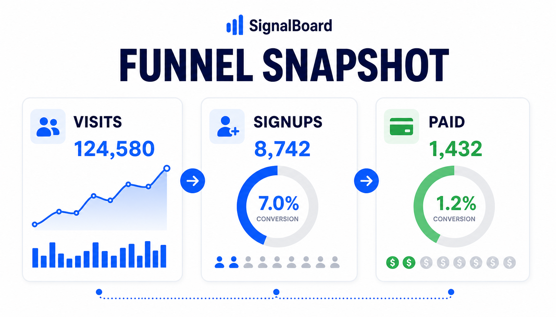
Generated in ImageLayer with General mode, GPT Image 2, X / Twitter (16:9), brand guidelines off.
Premium 16:9 bento infographic for fictional product analytics tool SignalBoard. Title reads exactly "FUNNEL SNAPSHOT". Three large cards: "VISITS", "SIGNUPS", "PAID". White background, deep navy text, electric blue and green accents, clean charts, simple icons, lots of whitespace, polished SaaS editorial style, no extra words, no watermark.Why it works: the prompt asks for three big labels, not a dense report. The model can keep the layout readable because each card has one job.
Reusable template:
Premium 16:9 bento infographic for fictional [PRODUCT CATEGORY] called [BRAND]. Title reads exactly "[TITLE]". Three large cards: "[CARD 1]", "[CARD 2]", "[CARD 3]". [BACKGROUND], [TEXT COLOR], [ACCENTS], clean charts, simple icons, lots of whitespace, polished editorial style, no extra words, no watermark.Example 2: Mobile App UI Mockup
Use this when you need a believable app concept for a pitch deck, PRD, or landing page before design is finalized.
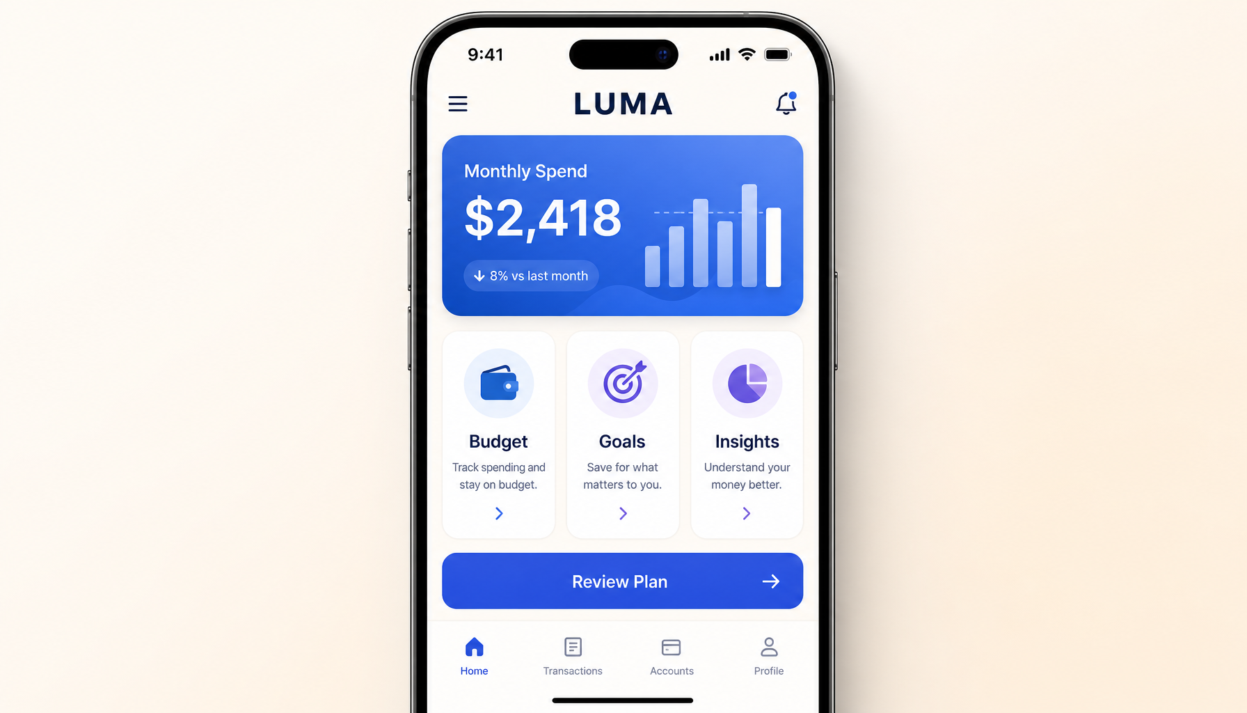
Generated in ImageLayer with General mode, GPT Image 2, X / Twitter (16:9), brand guidelines off.
High-fidelity mobile app UI mockup inside an iPhone frame, straight-on, for a personal finance app called "LUMA". Top status bar reads "9:41". Header title "LUMA". Main hero card shows "Monthly Spend" and "$2,418". Three feature cards below: "Budget", "Goals", "Insights". Primary CTA reads "Review Plan". Calm light mode, cream background, blue and violet accents, rounded cards, realistic iOS spacing. No fake logos, no unreadable microtext, no watermark.Why it works: the prompt names the screen, app category, hero area, card labels, CTA, and visual system. It does not ask the model to invent the product.
Reusable template:
High-fidelity mobile app UI mockup inside an iPhone frame, straight-on, for a [APP CATEGORY] called "[APP NAME]". Top status bar reads "9:41". Header title "[APP NAME]". Main hero card shows "[HERO LABEL]" and "[HERO VALUE]". Three feature cards below: "[CARD 1]", "[CARD 2]", "[CARD 3]". Primary CTA reads "[CTA]". [STYLE]. No fake logos, no unreadable microtext, no watermark.Use ImageLayer templates when the format repeats
ImageLayer already has an Infographic content type. Use it when customers need recurring process visuals, educational cards, or internal documentation graphics.
For UI mockups, start in General mode today. If a customer repeats the same format often, turn it into a custom content type with fields like:
- App Name
- App Category
- Hero Component
- Card Titles
- CTA
- Style Notes
That is the pattern: prove the prompt once, then convert the repeatable parts into fields.
Common failures and fixes
Failure: The infographic has extra labels.
Fix: Add “Render only the provided text. No extra facts, labels, captions, or statistics.”
Failure: The UI looks pretty but impossible to use.
Fix: Specify hierarchy before style. Name each screen area and what it contains.
Failure: The chart looks like real data but is invented.
Fix: Use it as an illustrative visual, or provide the exact numbers and say “do not invent values.”
Failure: Text is too small.
Fix: Reduce the amount of copy and specify “readable at mobile feed size.”
The practical rule
Structured visuals succeed when the model has a structure to obey.
For GPT Image 2, the structure is the prompt. For ImageLayer customers, the structure should become templates. The more often the visual repeats, the less often a user should have to write the prompt from scratch.
Keep exploring
- Explain Any Process in a Single Image - The ImageLayer Infographic template.
- GPT Image 2 Playbook - The broader GPT Image 2 workflow.
- Content Type Templates vs. Freeform Prompts - Why templates beat blank prompt boxes for repeatable work.
- Content Type Templates - How to operationalize structured visuals.